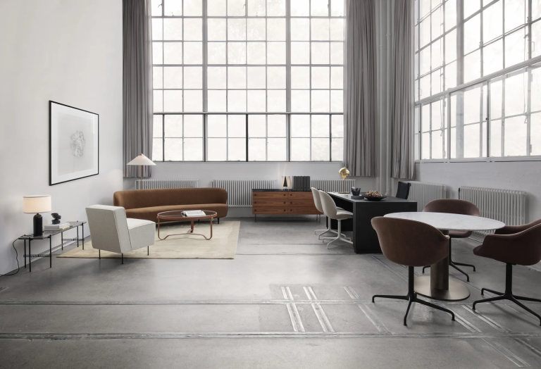
Gubi: Where Scandinavian Heritage Meets Contemporary Glamour
Scandinavian design is usually praised for what it leaves out. Gubi is known for what it puts back in. Where the tradition reaches for restraint,

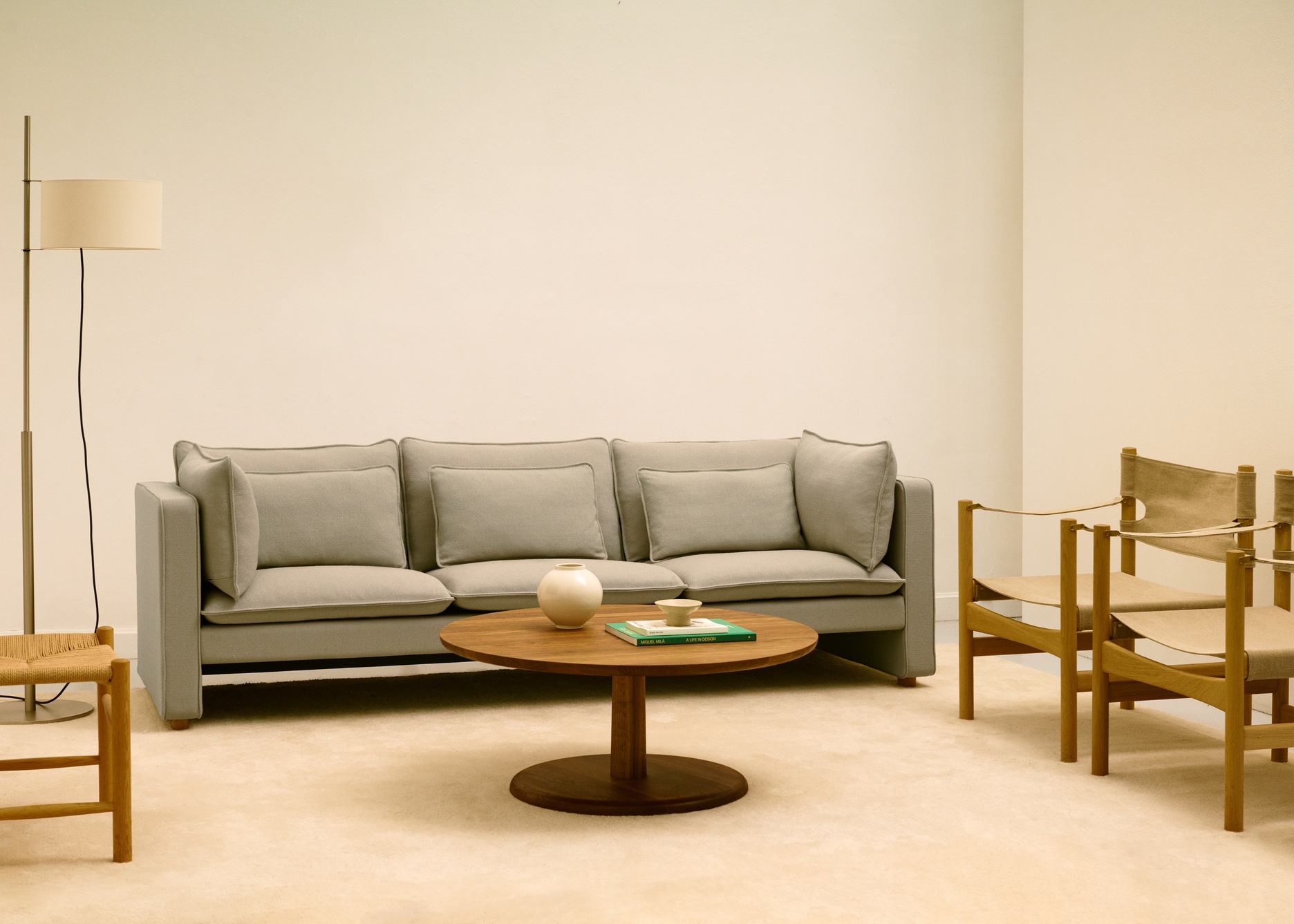
Understanding why Singapore interiors defaulted to beige for so long is the starting point for understanding why that is now changing. Beige minimalism was a rational response to several converging pressures. Singapore’s property market rewards resale value, and neutral interiors photograph well and appeal to the broadest possible range of buyers. Renovation timelines in Singapore are tight, and a neutral palette is the fastest way to produce a result that looks classy and considered without requiring the deeper decision-making that colour demands. It’s also a safe choice for first time homeowners, unsure of their design aesthetic.
The problem with safe is the same problem it has always been. Safe ages without improving. A beige living room that looked fresh in 2018 looks tired in 2026 not because the furniture has worn out but because the palette has no intrinsic depth to draw on. Colour, by contrast, deepens with age. A cognac leather sofa develops a richer patina over five years. A forest green wall reads differently across morning and evening light. A terracotta rug softens and settles into a room in a way that a cream one never quite does. The interiors that are moving beyond beige are not chasing a trend. They are making a longer-term investment in rooms that improve with time.
The palette replacing beige in Singapore’s luxury interiors is not bold in the fashion-season sense. It is rich, earthy, and grounded in natural pigments that have an enduring visual logic rather than a seasonal relevance. The colours appearing most consistently in the most considered Singapore homes of 2026 are:
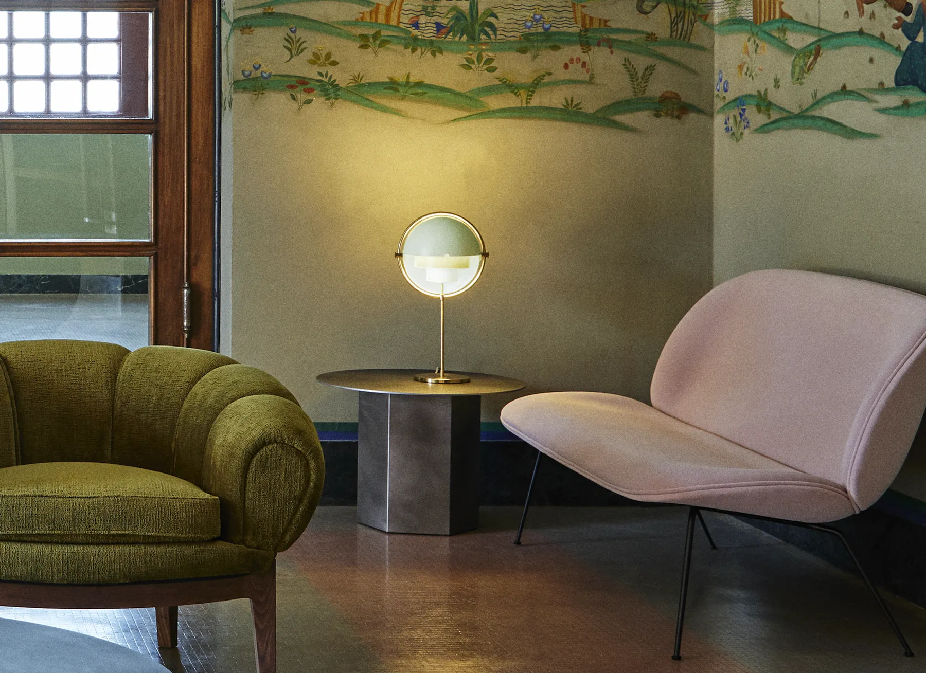
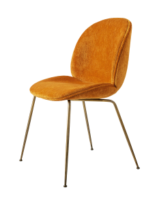
Terracotta and warm rust tones in upholstery and soft furnishings. These are the colours that carry a warmth that no neutral can replicate. Cognac leather in particular has become one of the defining material choices of the moment, appearing in lounge chairs and sofas that anchor a room with a confidence that cream upholstery cannot achieve.
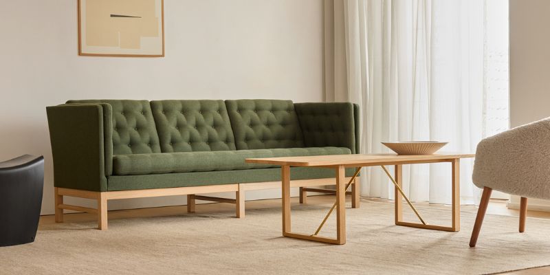
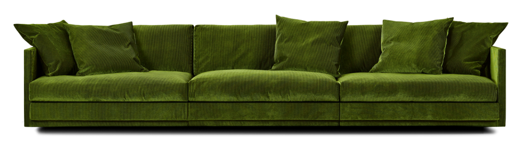
Deep forest green, applied to a single sofa or a pair of lounge chairs against a white or plaster wall. Green has a unique spatial quality. It recedes visually while asserting itself materially, making a room feel larger and more considered simultaneously.
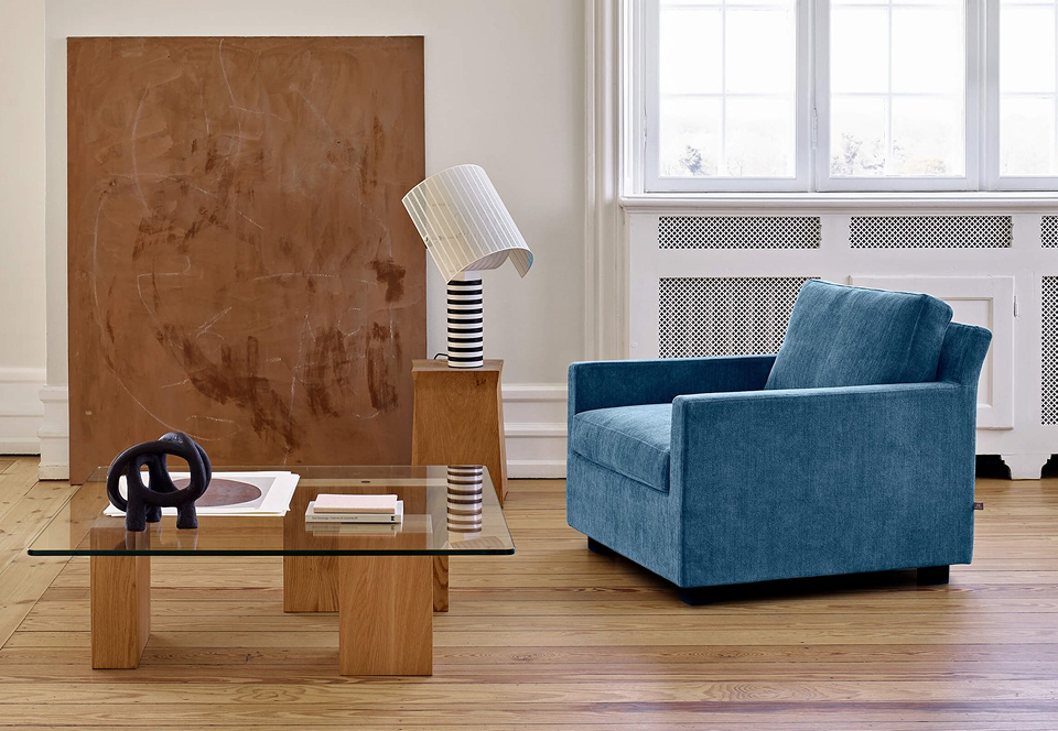
Slate blue and smoked grey, used in fabric upholstery and in the painted or lacquered finishes of sideboards and cabinets. These are colours that read as contemporary and age exceptionally well against the warm timber tones that appear throughout Scandinavian furniture design.
Warm walnut and dark oak, not as neutral timber but as a colour statement in their own right. The deep, warm brown of solid walnut against a white wall is as much a colour decision as a material one, and it is one of the most enduring in the history of Scandinavian interior design.
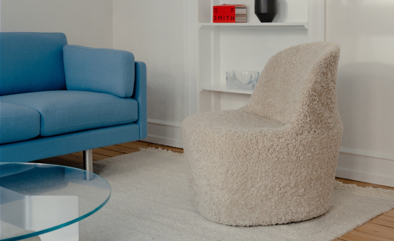
Moving beyond beige does not mean abandoning the considered restraint that makes a Singapore interior work. It means making colour decisions with the same intentionality that the best Scandinavian furniture is designed with. The principles that produce a coherent colour-forward interior are consistent regardless of the specific palette:
Start with one anchor colour and build the palette around it. A cognac leather sofa is a strong enough colour statement to anchor an entire living room. Everything else in the room, from the rug tone to the wall paint to the side table finish, should be chosen in relation to that anchor rather than independently.
Use colour in the largest pieces. A coloured sofa, a coloured lounge chair, or a coloured cabinet makes a more enduring statement than a coloured accessory, which can sometimes feel like a random edition. The investment pieces at the heart of the room are where colour delivers the most lasting value.
A single piece of coloured upholstery in a neutral room is almost always sufficient to shift the character of the space significantly. Restraint in the number of colour decisions is as important as boldness in the individual choices. Natural materials carry colour differently from synthetic ones and almost always produce a more satisfying result.
The move toward colour in Singapore’s luxury interiors aligns naturally with the direction that Scandinavian furniture design has been moving for several years. Brands like GUBI, Fredericia, and Eilersen have consistently offered their most significant pieces in a colour palette that extends well beyond neutral upholstery options. The GUBI Beetle Lounge Chair in a deep green velvet. The Fredericia Swoon Chair in a rich burgundy bouclé. The Eilersen Playground Sofa in a warm terracotta performance fabric. These are by no mean recent additions to the product range. They are the options that Singapore customers chose less frequently during the beige decade and are now specifying with increasing confidence.
At Danish Design Co, we have observed this shift directly in our showroom conversations. Three years ago, the majority of sofa and lounge chair orders were specified in neutral grey, cream, or natural leather tones. Today, a growing proportion of customers arrive with a colour in mind and ask to see it in the material before committing. The decision-making by buyers has become more confident, more personal, and more considered.
The concern that stops many Singapore homeowners from committing to colour is the same concern that drove the beige decade: resale value. The assumption is that a neutral interior appeals to more buyers and therefore holds its value better. This assumption deserves scrutiny. A well-furnished interior with considered colour choices and high-quality furniture holds its value not because of the palette but because of the quality of the furniture and the coherence of the design. A beige interior furnished with low-quality pieces and a coloured interior furnished with pieces from Fredericia or Eilersen are not equivalent propositions, regardless of how they photograph.
The furniture that holds its value across decades is the furniture built to hold up across decades. A Fredericia sofa in a rich terracotta fabric maintains its structural and material quality as reliably as the same sofa in grey. The colour is a choice about how the room feels to live in. The quality is what determines whether the piece is still in the room in fifteen years.
Danish Design Co carries furniture from GUBI, Fredericia, Eilersen, and Naver Collection across a full range of upholstery colours, leather tones, and timber finishes. Our showroom displays multiple coloured configurations in full scale, allowing you to see how specific colours perform in a real room setting rather than a product photograph. Our team can advise on colour selection, palette coherence, and how a specific piece will work within your existing interior before you commit.


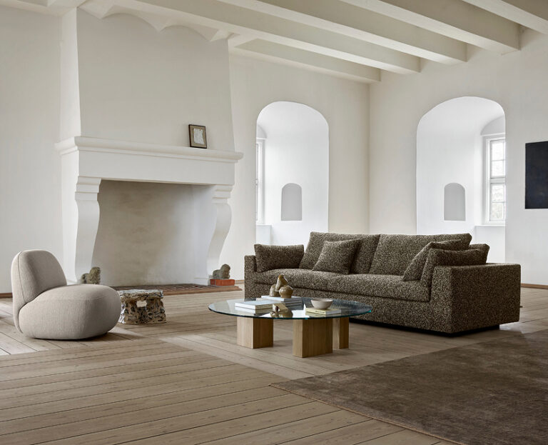

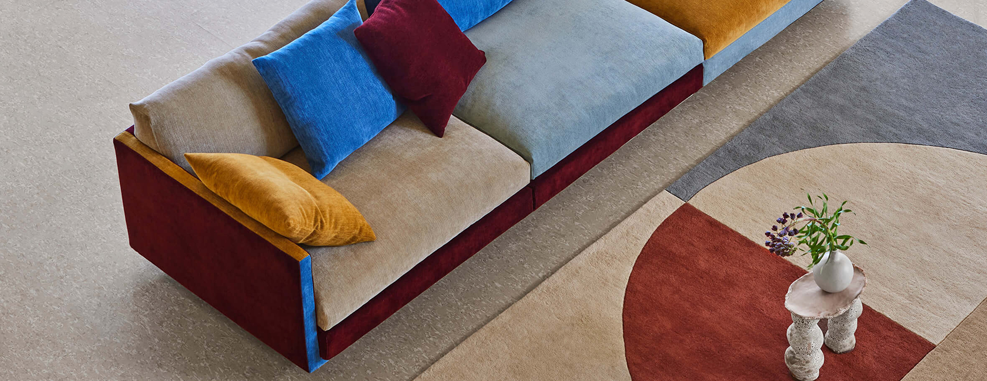
Scandinavian design is usually praised for what it leaves out. Gubi is known for what it puts back in. Where the tradition reaches for restraint,
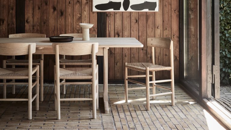
Some furniture houses chase the look of the moment. Fredericia has spent over a century doing the opposite. The Danish house is known for pieces